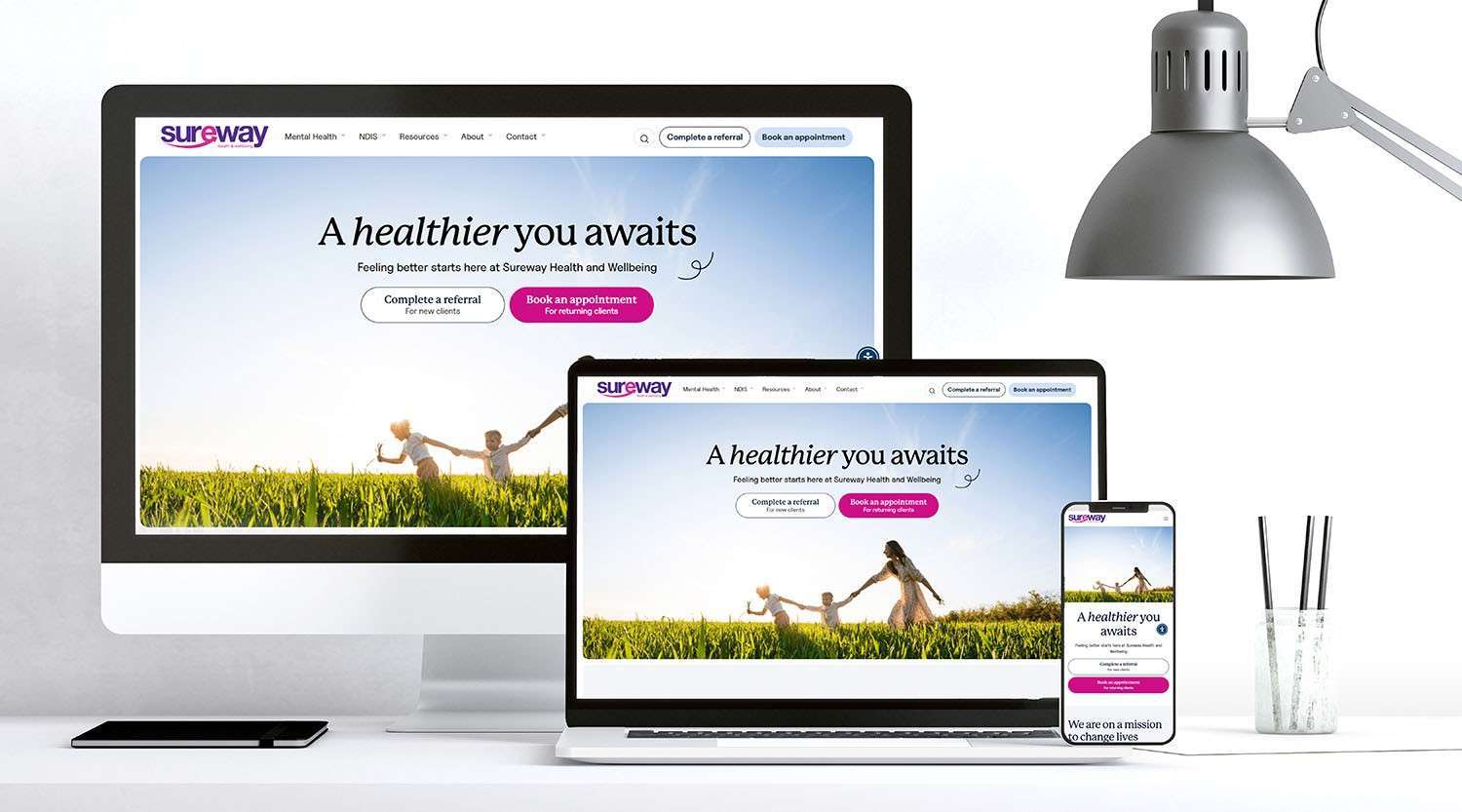
A high-performing website isn’t just about good looks—it’s about strategy. At Digital Marketer Bee, we’ve helped businesses across various industries turn underperforming websites into lead-generating machines through a smart mix of UX-focused design, SEO, and targeted digital marketing. If your website isn’t delivering results, chances are a few strategic tweaks could make all the difference.
16 April 2025
When was the last time you opened a website on your phone and left straight away because it was hard to read, took too long to load, or was just plain confusing to use? Chances are, it didn’t leave the best impression.
Now, imagine if that’s what potential NDIS participants or their families experienced when they visited your NDIS business’ website.
If you’re an NDIS provider, having a mobile-friendly website isn’t just a nice bonus — it’s an essential way to make sure people can find you, connect with you, and get the support they need.
Why Mobile Responsiveness is Important
More than ever, people are using their phones to search for services, check information, and get things done online. And in Australia, that trend isn’t slowing down.
Below are a couple of quick facts from Red Search:
- On average, Aussies spend around 6.8 hours a day online.
- About 55% of them prefer using mobile phones instead of a laptop or desktop computer to go online.
What does this mean for you as an NDIS provider? If your NDIS website isn’t easy to use on a phone or tablet, you could be missing out on reaching more than half of the people looking for services like yours.
A mobile-friendly site helps ensure that whenever someone searches for help or information, they can access what they need from your website quickly and easily.
The Impact of Mobile-Friendly Websites on NDIS Participants
The concept of website accessibility is all about making sure that online platforms can be easily accessed by anyone regardless of their disabilities. This also applies to mobile responsiveness since more people prefer to use their handheld devices to search for services online instead of computers.
Likewise, many NDIS participants, carers, and families use their phones to browse, make enquiries, and read up on the services you offer. If your website is slow to load, tricky to navigate, or hard to read on a phone screen, it can hurt your site’s mobile accessibility, causing visitors to leave and look elsewhere.
Making your site easy to use on a phone means:
- Participants can learn about your services on the go
- Families can contact you without having to zoom in or hunt through menus
- It’s easier to find things like programs, events, and booking options
In short, it helps make your services feel more welcoming and accessible — just like they are in real life.
How Can You Make Your Website Mobile-Friendly?
You don’t need to completely rebuild your website from scratch to make it mobile-friendly. Here are a few things you can do:
- Make sure it adjusts to fit different screens. This helps your site look great on phones and tablets, not just computers.
- Keep things simple and quick to load so people won’t wait around if your site takes too long, especially on mobile.
- Use easy-to-tap buttons and simple menus. This makes it easier for users to find what they need without frustration.
- Choose readable fonts and layouts since no one likes pinching and zooming to read tiny text.
- Test it out yourself by opening your website on your phone and pretending you’re a participant. This allows you to identify any accessibility barriers to your website.
But, if all of that sounds a little overwhelming, don’t worry — that’s where we come in.
Digital Marketer Bee’s NDIS web design and development team is dedicated to building custom websites that are not only beautiful and user-friendly but also designed with your audience in mind.
We understand how important it is for NDIS providers to be easy to find and connect with online, and we’re here to help you create a site that feels just as supportive and reliable as your services.
Plus, we’ll make sure that your website complies with the latest accessibility standards, allowing you to provide an inclusive online space for NDIS participants.
Mobile Responsiveness as an SEO Strategy for NDIS Providers
That means if someone searches for NDIS services in your area, a mobile-friendly website can help you appear closer to the top of the results. And when you’re easier to find, you’re more likely to get that call, that booking, or that referral.
Making your site mobile-friendly can help you:
- Show up more in local searches
- Get more visitors to your site
- Build trust with people as soon as they land on your homepage
- Increase the chances they’ll take action — whether that’s booking a service or reaching out to learn more
This is the main reason why mobile responsiveness is regarded as one of the main SEO strategies that NDIS providers can implement as part of their digital marketing efforts.
If you’re an NDIS provider who wants to connect with more participants, build trust online, and offer a smoother experience from the very first click, then you should make sure that your website is mobile-friendly.
As mentioned earlier, mobile responsiveness for NDIS providers is all about making sure your support services are easy to find, easy to understand, and easy to access for everyone, no matter what device they’re using.
And if you’re ready to make your website work better for you and the people you support, we’d love to help. Book a free call with Digital Marketer Bee, and let’s chat about how we can create a site that’s not just mobile-friendly but participant-friendly too.

Author
Bee bowman
Bee is a digital strategist passionate about helping brands grow through thoughtful design and smart marketing. With a focus on websites, SEO, and paid media, they turn digital spaces into real business results.
Share this post
More insights

By optimising your online presence and taking advantage of tried-and-tested digital marketing strategies, your NDIS business will be able to stay ahead of your competitors.

Through their service, NDIS businesses are able to help their clients experience positive changes in their lives. This is why it’s important for NDIS businesses to continuously promote their services in order to help more people by turning them into clients.

Incorporating accessible web design elements into your website is a vital step that you should take to elevate the services of your NDIS business.

Over the years, Facebook has revamped its advertising features by providing users with an array of tools that can help them effectively amplify their reach, engage their target audience, and boost the online success of their brands.

Whether it’s signing up for a newsletter, making a purchase, booking an appointment, downloading a resource, or simply sending an enquiry, a well-crafted CTA button can make all the difference between a casual visitor and a converted customer.
Through an effective digital marketing strategy, you can tailor your promotional efforts towards targeting individuals who are interested in your NDIS-related services.
